It’s the color spectacle many look forward to each year, and PANTONE has not disappointed. Going with trends and futurists foresight, a softer look on hues for 2106 came to fruition. The selected PANTONE Color of the Year 2016 is actually two colors: Rose Quartz and Serenity. The merging of these two shades go against the convention and perception of color unification. Together, these two colors represent an intrinsic harmony between a cozier tactile rose color and the aloof shade of placid blue. So, what interior decorating ideas are suitable to convey the distinctiveness of these celebrated colors?
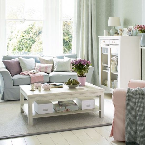
Image: housetohome
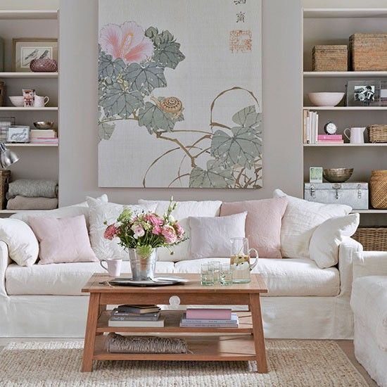
Image: housetohome
Here are five ways to add coolness to your home using the 2016 PANTONE Color of the Year:
1. The Sky Is The Limit
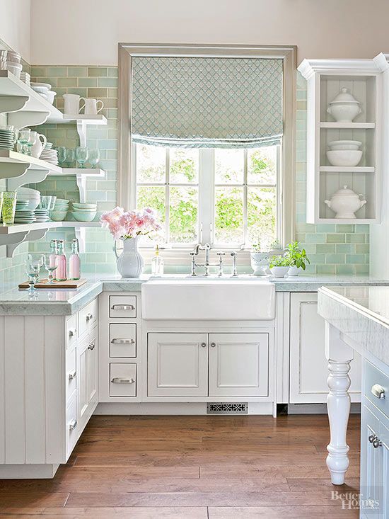
Get your creative juices going by adding dishware to a pastel blue wall. Use porcelain dishes with unique blue and white borders to bring out the vividness in the wall design.
Image BHG
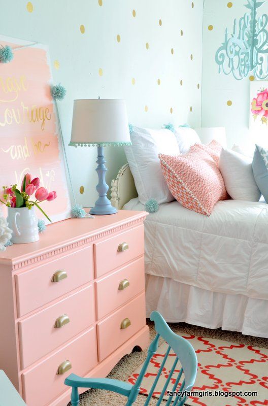
2. Let The Kids Join In
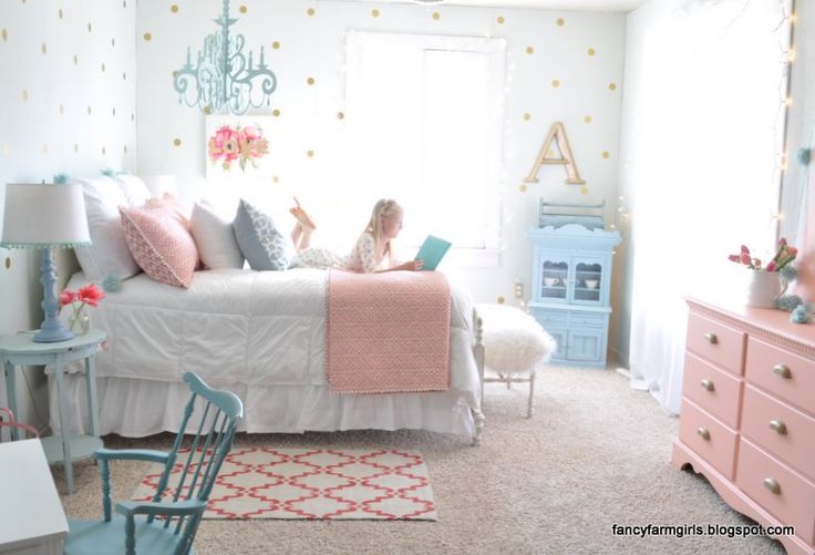
Create a light, playful ambiance in a kid’s room by using both PANTONE 2016 colors. Cover beds in Serenity or Rose Quartz shades. Depending on the age, add a subtle light in Rose Quartz to produce subtle illumination. Don’t forget about patterns. Stripes, geometric shapes, flowers, they all work! Don’t forget about accent pieces like rugs, lamps, and pillows.
Image: fancyfarmgirls
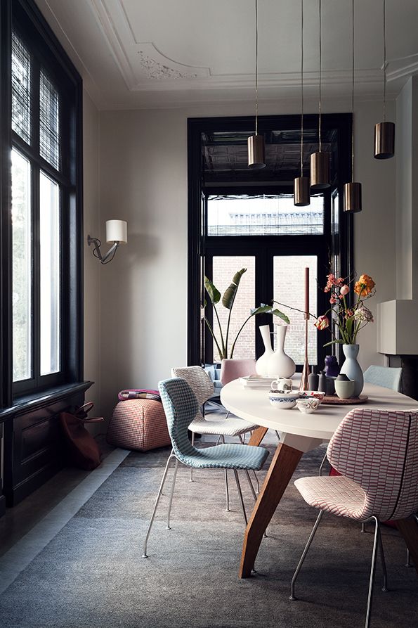
3. Eat Surrounded By Pastel Hues
Dress up your dining room chairs with a durable fabric in one or both of the 2016 colors. Add dramatic floor to ceiling curtains in Rose Quartz or Serenity. Add a table runner with a merging of the two shades. Remember to mix patterns to add an individualistic effect. Make the décor modern with traditional overtones.
Image: design on stock
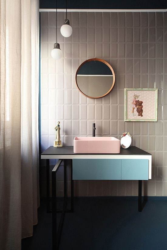
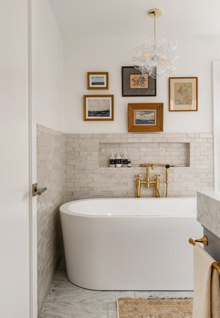
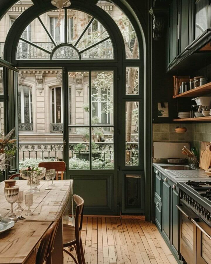
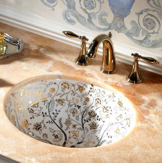
4. Give Your Bathroom A Makeover
You can’t beat a soft blue painted wall or blue tiles in a bathroom. This hue is known to have a calming spa like effect, but don’t stop at the walls. A dynamic shower curtain in either 2016 PANTONE color whether in a pattern, one color, or a combination of the two will add that “wow” factor to your bathroom décor.
Image: UdA
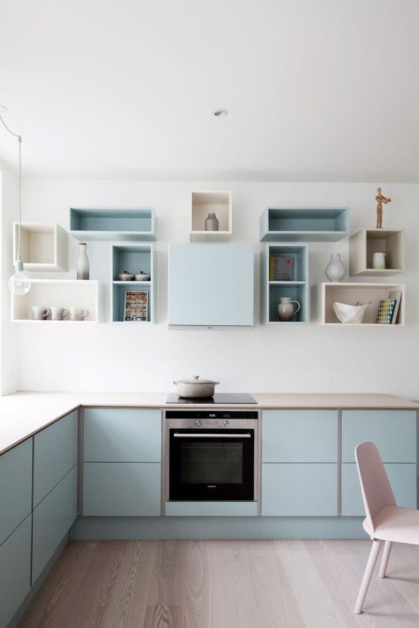
5. Use Both Hues In The Kitchen
Try a gingham printed cloth for curtains in Serenity. Add cushions to kitchen chairs in Rose Quartz in an abstract pattern. Both colors add a refreshing effect to any kitchen. Not only that, you are sure to revive your kitchen space in a major way without paying over the top for it!
Image: boligcious
Other ways you may want to use PANTONE 2016 Colors include accent chairs, ottomans, artwork, lamp shades, window blinds, and mirror frames.
Image: fancyfarmgirls
Simply Beautiful Melina. You’ve done it yet again! The 2016 Pantone Color of the Year in all your decorating options are just gorgeous! Your eye for details is such a visual treat! Thank you for starting off the New Year in a beautiful colorful way! Always enjoying, CJD.Sign