One of the most important elements in interior design and decor is the choice of colors. It is also one of the biggest challenges because colors have a tremendous impact on creating a certain ambiance. We can put just one detail in a different color, and the whole space gets a different look.
How many times have you been asked what your favorite color is – at least a few hundred times so far. But the fact is, that no matter what our favorite color is, we will never surround ourselves exclusively with it. It is the same with interior design – imagine a space where everything is in one color, including you who walked into it in clothes of the same color. See? No, of course.
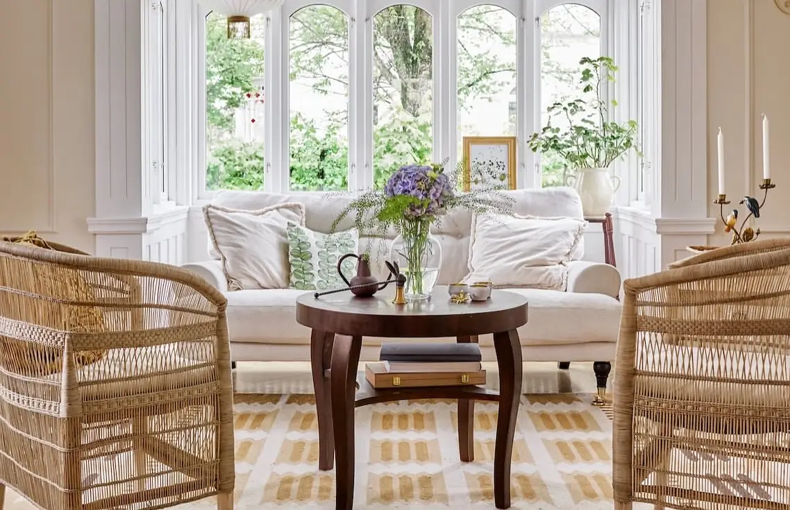
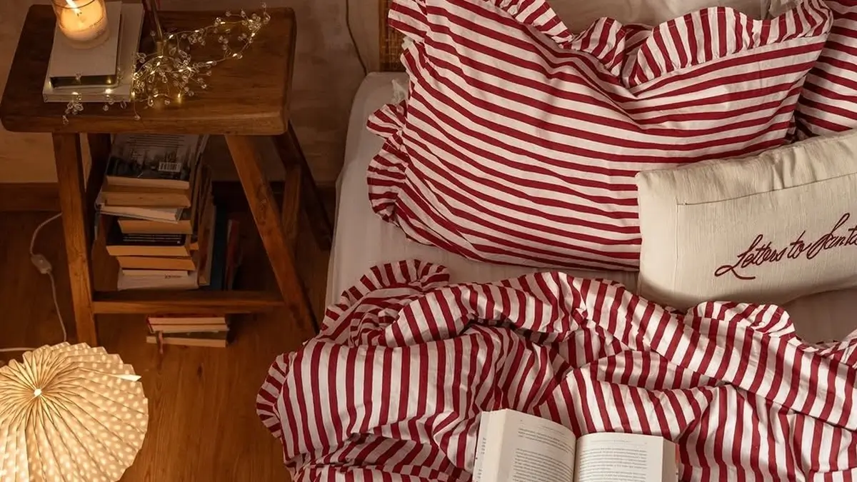
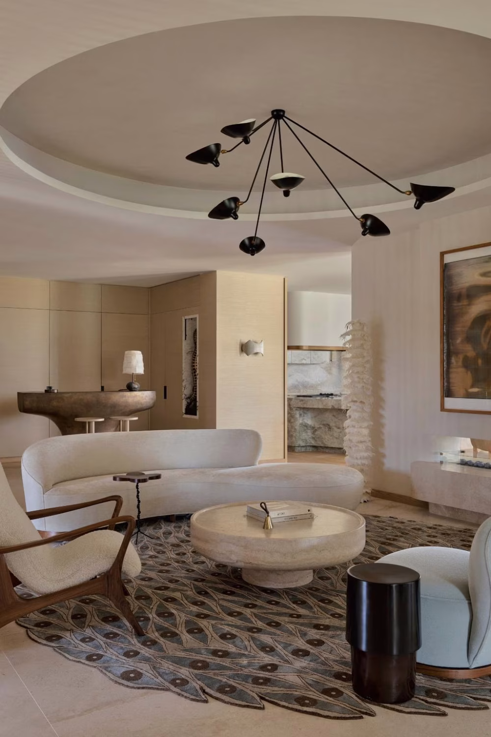
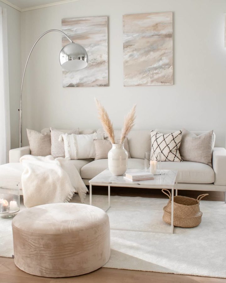
Images: loving white style
Color arrangement
The basic arrangement of colors starts from the wheel of colors – that is, the spectrum of colors connected in a circle.
The first pie chart was developed by Isaac Newton in 1666, and since then many scientists and artists have studied and designed numerous variations of the concept.
The color wheel is a simple and ingenious tool with the help of which we can create a certain harmony by merging two or more colors into one whole. Many different colors can be displayed on a color wheel, but the most important is that they are arranged in a logical sequence.
The version of the color wheel you should learn about is the one with 12 colors. In this model, we differentiate between primary colors – red, yellow, and blue, that cannot be obtained by mixing other colors. The second ones are the secondary colors – green, orange, and purple, that are obtained by mixing primary colors. Finally, there is a third color group that is obtained by mixing primary and secondary colors.
In addition to the choice of colors, the ratio of their application in interior adaptation is also important. Apply the 60-30-10 rule for balanced color selection, which says that one color occupies 60% of the space (the walls), the other 30% (for example – furniture, shelves), and the third should be in traces (decor).
The color temperature – Warm and cold color tones
We should recognize the difference between the warm colors – red, orange, and yellow and cold ones – blue, purple, and green. Warm colors are usually more energetic and bring a sense of liveliness and stimulation to space. On the other side, cool colors can be used to tranquilize and bring a comfortable feeling to the room. Before choosing the color temperature, consider the size of a room. Using warm paint in a tight room can create a feeling of claustrophobia.
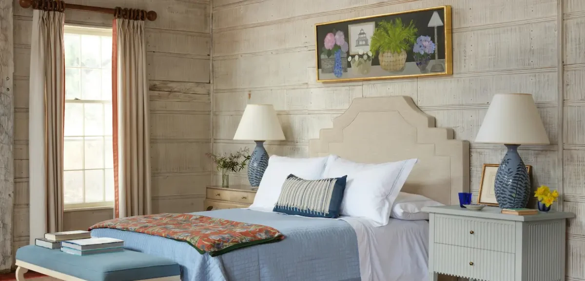
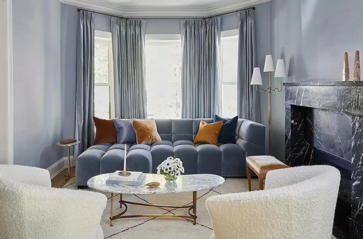
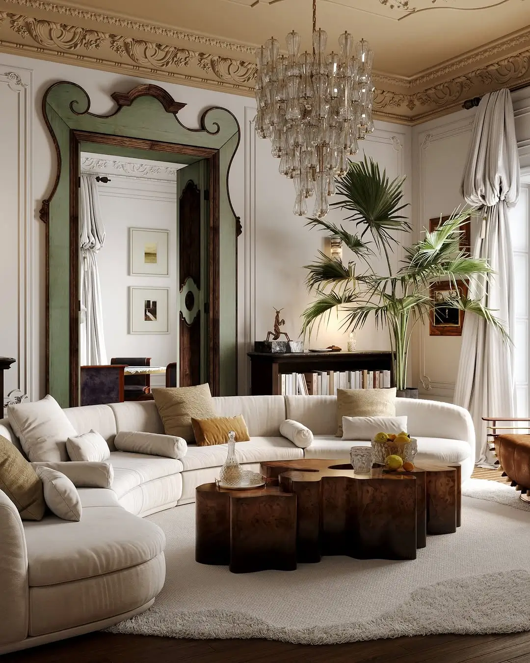
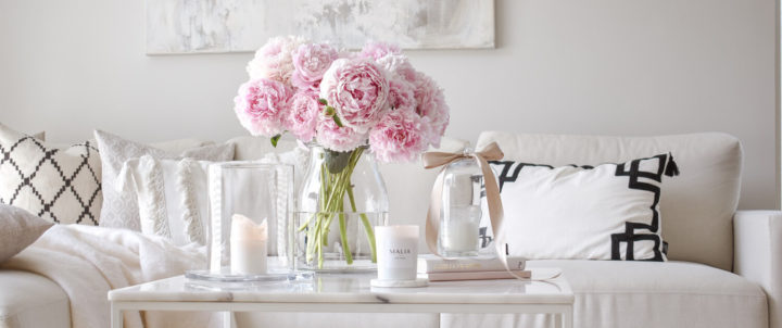
Image: ideal home
Analogous color for harmony and comfort
An analog color scheme refers to the use of three colors in a row from a wheel of colors. Typically, the two colors will be the main colors with a third shade that is a blend of the two colors and the secondary color. For example, you can choose red, purple and blue, orange and yellow or red. The key to using this color scheme successfully is proportion. Choose one color to dominate, one to support the predominant color, and a third light color for accents.
You can create a similar color scheme using neutral colors. It is usually called a monochromatic color scheme. The best example of an analog color scheme is the analog gradation of leaf colors in autumn. In art, one example of an analogous arrangement of colorings is Van Gogh’s Sunflowers.
Examples:
- Green (60%), yellow-green (30%) and yellow (10%)
- Yellow-orange (60%), orange (30%) and red-orange (10%)
- Purple (60%), red-purple (30%) and red (10%)
Once you have selected a color system for the main room in your home, pick one color nuance from it to place around the house. You can always add other colors to the main color when moving from one room to another. This approach will keep the decor in your home fluid and cohesive without being too similar in every room.
Complementary colors
They are located on the opposite sites in a circle. Pay attention to the shades because each color shade has its corresponding pair. The high contrast of these colors creates a vigorous and lively look of the space, and therefore should not be dominated by both complementary colors in the same space.
Harmonic schemes
In this scheme, all colors are harmonious and do not compete with each other. No color requires special attention, so the prevailing mood is soothing. There are two basic types of harmonic schemes.
A one-color scheme includes a low-intensity color such as beige, light gray, or white in a limited range. It is a scheme that is often used for exhibition space because its calmness creates a perfect background. Any bright or conspicuous object introduced into this scheme will draw attention to itself by interrupting the monochromatic, which you can also use as an advantage if you want something to be noticeable.
A monochromatic scheme consists of a single shade but in a wider range of values and intensities than a monochrome scheme. A monochromatic scheme based on yellow, for example, could include light yellow, lemon yellow, and golden yellow that can be used individually or in combination. The monochromatic scheme makes the whole space special.
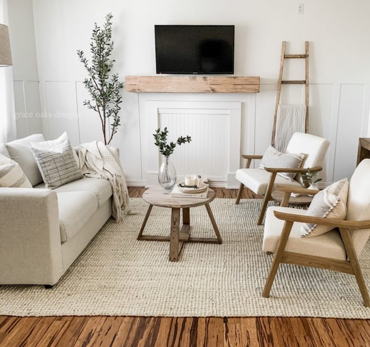
Image: grace oaks designs
Select the appropriate color for space and decor
Paints give surfaces and objects in addition to the desired optics and several other important properties such as smoothness, structure, transparency, gloss, water resistance, resistance to atmospheric conditions, UV resistance, strength, elasticity, resistance to fungus, easy to clean, light fastness, and brightness.
As a rule, care should be taken when planning all the desired characteristics, but not to overdo it. Each additional characteristic is achieved by additional color contents, which in the long run, can have negative consequences for health.
And finally, a thing to remember – colors bring liveliness to our home, but too many mismatched colors can result in strenuous color and too little with a sterile interior. That is why it is important to know which color combinations to use and in what proportion to achieve balance and comfortable home.
Discover more from Decoholic
Subscribe to get the latest posts sent to your email.