Every December, designers, artists and trend-watchers wait for the yearly pronouncement from the Pantone Color Institute. For 2026, they’ve done something unexpected — they chose Cloud Dancer, a soft, airy off-white, as the official color of the year.
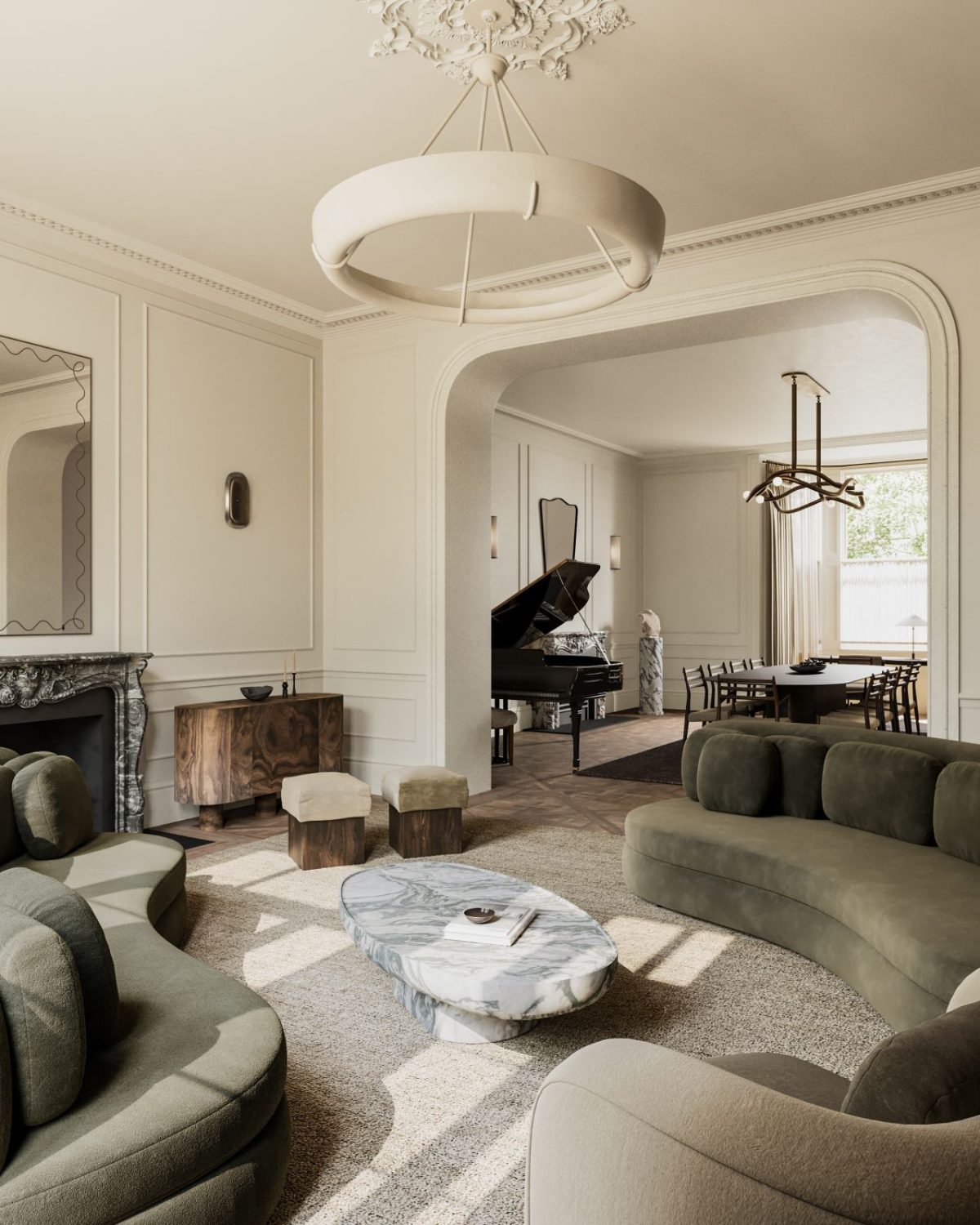
Cloud Dancer is described as “a lofty white” — not a vivid hue, but a neutral with presence. Its technical values hover around HEX #F0EEE9 / RGB (240, 238, 233) — a gentle, warm-toned white that’s far from sterile or clinical.
This marks the first time Pantone has ever picked a shade of white for Color of the Year — a bold departure from previous picks like vibrant purples or cozy earth tones.
Why White? What Cloud Dancer “Means” for 2026

- A “breath of calm in a noisy world.” Pantone frames Cloud Dancer as a response to societal overstimulation — a soft pause for quiet reflection, clarity, and inner peace.
- Blank canvas for creativity. Being neutral doesn’t mean invisible. Cloud Dancer acts like a scaffold for other colors — it allows bold tones to pop, pastels to glow, and textures to shine, giving designers maximal flexibility.
- A nod to minimalism and mindfulness. The shade reflects a broader cultural mood — one that values simplicity, intentionality, and mental space over visual overload.
- Universally adaptable. Whether used in fashion, interiors, tech, or product design, Cloud Dancer’s balanced warm-cool undertones make it seasonless, style-agnostic, and universally flattering.
What Cloud Dancer Says About 2026 — And About Us

- We crave calm. Amid global uncertainty, cultural noise, and fast pace — we’re collectively leaning toward serenity, mental space, and comfort. Cloud Dancer gives us that.
- Less is sometimes more. After years of bold, saturated palettes and maximalism, there’s a cultural pivot: sometimes the quietest statement is the strongest.
- Neutral doesn’t mean boring — it means potential. Cloud Dancer invites creativity: it’s not about demanding attention, but offering a foundation for expression.
- Universality matters. A white shade transcends geography, culture, season, gender — making it ideal for a globalized, diverse world.
How to Use Cloud Dancer — Pro Tips for Designers

1. Pair Cloud Dancer with Veiled Vista for Soft, Modern Freshness
Veiled Vista’s gentle mint-green undertone brings a soft breath of freshness to Cloud Dancer’s warm neutrality. Use this combination for tranquil bedrooms, welcoming entryways, or Scandinavian-inspired kitchens. Together, they create a clean but uplifting mood — perfect for spaces designed for clarity and calm.
2. Use Baltic Sea for a Crisp, High-Contrast Finish
If you want Cloud Dancer to feel bright and intentional rather than simply “white,” pair it with Baltic Sea. This cool, uplifting blue adds structure and contrast without feeling heavy. It works especially well in coastal-modern interiors or children’s rooms where playfulness meets clarity.
3. Layer Golden Mist for Warmth and Subtle Luxury
Golden Mist adds an earthy, muted yellow that gives Cloud Dancer instant depth. When used together, the palette shifts toward soft luxury — think understated hotel suites, sunlit living rooms, or tonal, textural spaces. This pairing is ideal for anyone seeking warmth without saturation.
4. Add Quiet Violet for Unexpected Sophistication
Quiet Violet brings a gentle, grown-up pastel to the palette. Against Cloud Dancer, it adds elegance and personality without overpowering the room. Use it in textiles, accent furniture, or artwork to introduce softness with a modern edge.
5. Create Tonal Harmony with Cloud Cover
Cloud Cover is the perfect mid-tone complement to Cloud Dancer — a warm greige that pulls the palette together. Layering these two creates a monochromatic, serene environment. This pairing is ideal for minimalists, Japandi interiors, and modern rustic spaces where nuance matters more than contrast.
6. Bring in Hematite for Depth and Grounding
Hematite’s deep taupe-gray adds weight and atmosphere to Cloud Dancer. This combination is perfect for grounding open-plan spaces or giving architectural details presence. Use Hematite for cabinetry, flooring, or statement furniture to bring stability to the palette.
7. Add Blue Fusion for Moody Contrast
Blue Fusion introduces a dramatic, cool contrast that keeps Cloud Dancer feeling fresh rather than flat. Use it for focal walls, statement upholstery, or accents to anchor a room. It delivers depth without overshadowing the serenity of Cloud Dancer.
8. Pair it With Romantic Airy Pastels and Sun-washed Hues

It’s a palette that leans into comfort, lightness, and emotional ease — perfect for serene bedrooms, spa-like bathrooms, or contemporary spaces that embrace softness without slipping into sweetness.
Final Thought: Is a Colorless Color the Boldest Statement of 2026?

It may seem counterintuitive — of all possible vivid, expressive colors, why choose a near-white? Yet that’s precisely why Cloud Dancer is groundbreaking. In an era saturated with imagery, noise, and constant stimulation, the choice of a whisper-quiet, soft white is a radical act: a call for clarity, calm, and creative space.
Whether you’re a designer, an artist, or just someone who loves subtle beauty, Cloud Dancer offers a fresh start — a quiet invitation to reflect, create, and build something meaningful on a clean canvas.
Discover more from Decoholic
Subscribe to get the latest posts sent to your email.