You know those homes that feel incredibly luxurious but somehow also deeply calming? Like every material is rich, every line is intentional, every piece of furniture could easily belong in a gallery…yet the overall effect is still soft, serene, and quietly livable? THIS is one of those homes.
Designed by Charles Zana for a couple of passionate art collectors, this Paris apartment at the foot of the Eiffel Tower is actually the third residence he has created for them—which honestly tells you everything you need to know. When clients come back to the same designer multiple times, it usually means there’s a level of trust and understanding that allows the work to become more nuanced, more personal, and frankly more interesting.
And wow, is it interesting.
What immediately struck me about this apartment is the way Zana plays with contrast without ever making the space feel heavy. There’s this constant rhythm between light and dark, matte and polished, soft curves and strong geometry. It feels very composed, very Parisian, but not in that overly ornate “museum apartment” way. Instead, it feels contemporary, tactile, and incredibly sophisticated.
The Dark Hallways Are Giving Boutique Hotel Energy In The Best Way
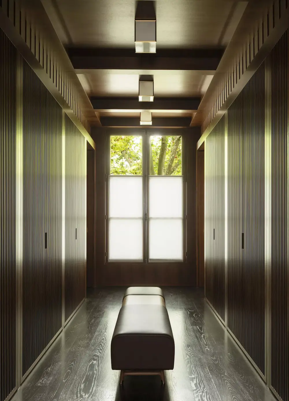
Let’s start with those hallways because honestly…I gasped a little.
The deep espresso-toned wood paneling paired with the slatted detailing and coffered ceilings creates this cocoon-like atmosphere that feels both architectural and intimate. It’s moody, yes, but not gloomy. The soft lighting and the glow from the windows keep everything warm and inviting.
And that bench running down the center? Such a smart move. It turns a transitional corridor into an actual experience.
I also love how the darker circulation spaces make the lighter rooms feel even more luminous when you enter them. That contrast is intentional throughout the apartment and it works beautifully.
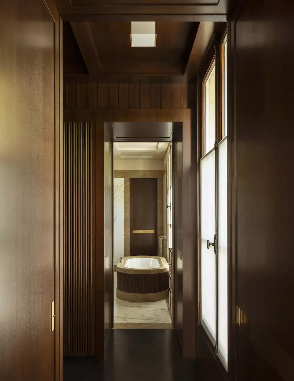
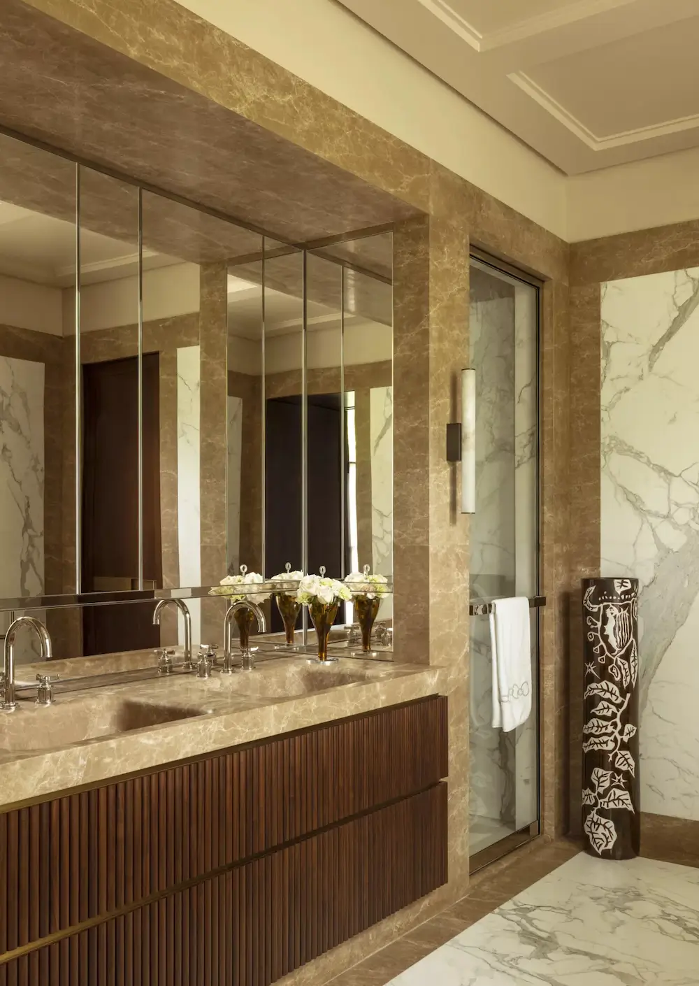
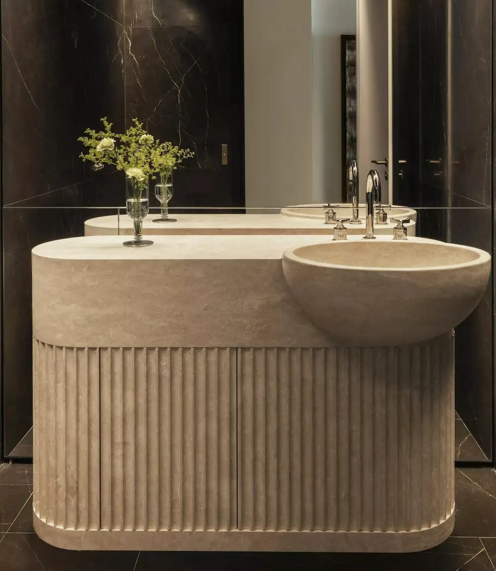
The Stonework Is Absolutely Carrying This Entire Apartment
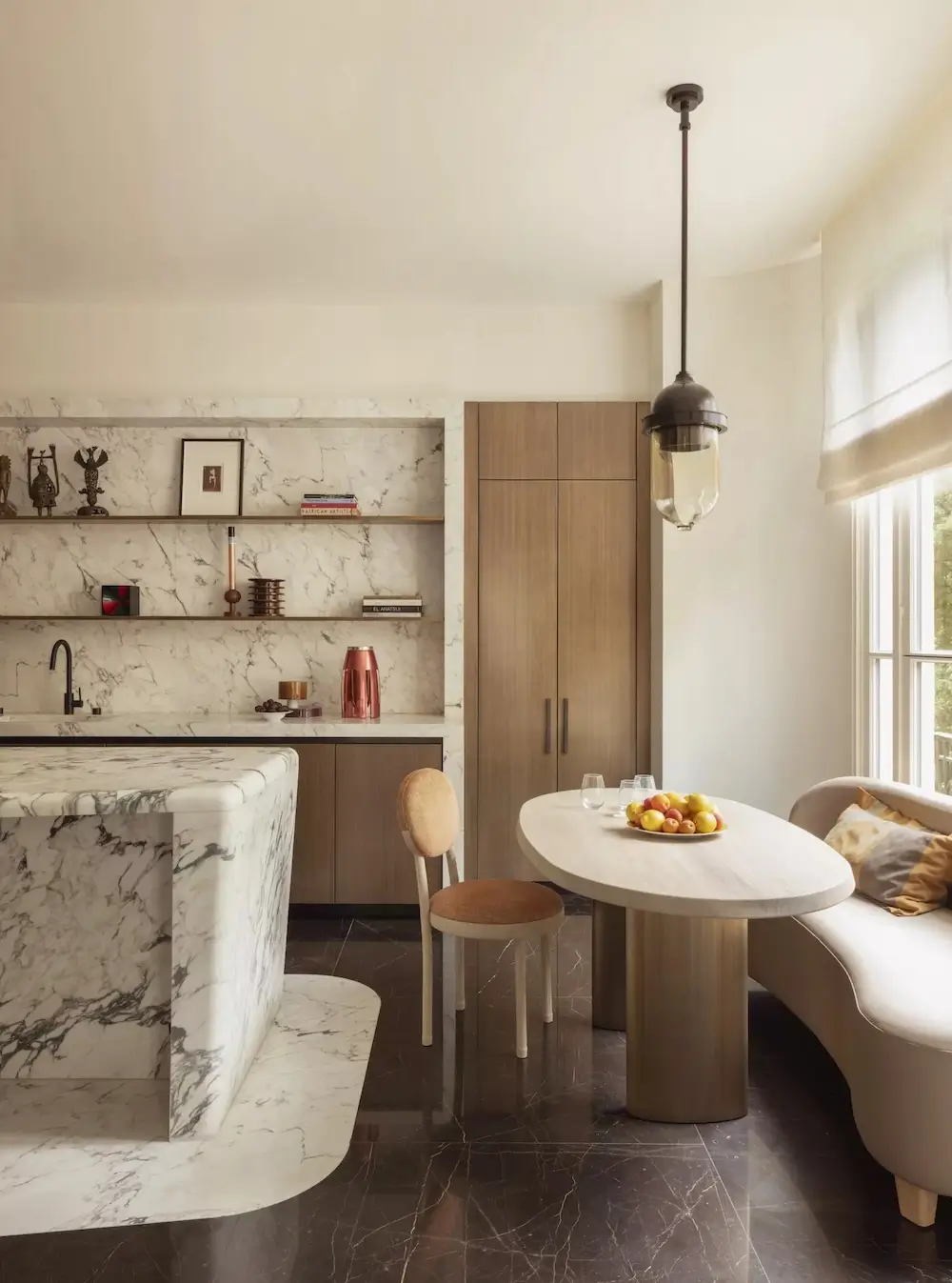
There’s a LOT of marble happening here and somehow none of it feels excessive.
That’s probably because the stone selections are restrained and thoughtfully paired with quieter materials. The marble in the kitchen feels sculptural and soft instead of flashy, especially alongside the warm oak cabinetry and the curved dining banquette. Meanwhile, the bathrooms lean into richer brown stones with dramatic veining that add depth without becoming visually chaotic.
And can we talk about the fluted detailing on the vanities? Because apparently I’m never getting tired of fluting when it’s done this well.
The rounded vanity in the darker bathroom especially feels like functional sculpture. The proportions are beautiful and the repetition of vertical texture throughout the apartment creates continuity from room to room.
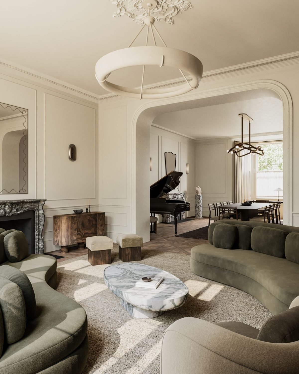
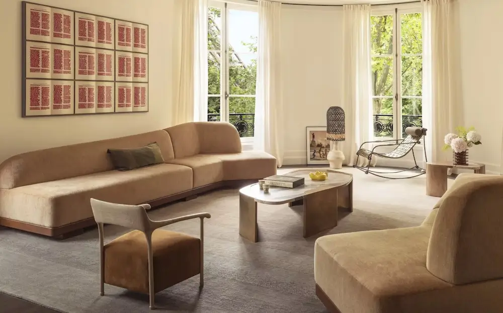
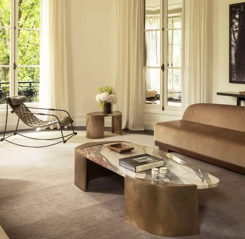
There’s Geometry Everywhere But It Never Feels Rigid
One of the most interesting aspects of this apartment is how Charles Zana uses pattern architecturally rather than decoratively.
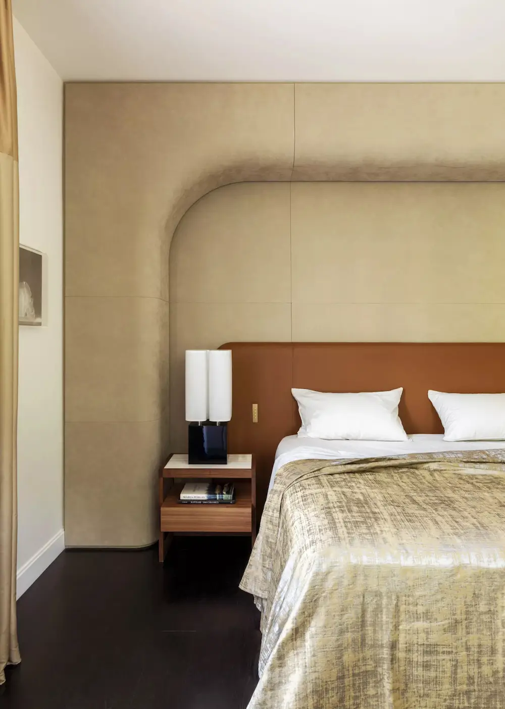
The grid flooring, ceiling coffers, slatted millwork, and curved built-ins create visual rhythm without relying on bold colors or busy styling. Even the furniture echoes those same ideas—softly curved sofas, rounded coffee tables, sculptural forms layered against stricter architectural lines.
It’s minimalism, but warm minimalism. Which, in my opinion, is the hardest version to pull off.
The living room especially nails that balance. The palette is almost entirely neutral—creams, cognac, walnut, black accents—but the room feels incredibly dynamic because of the shapes and textures. Nothing is shouting for attention, yet your eye keeps moving around the space discovering new details.
The Art Feels Integrated Instead Of “Placed”
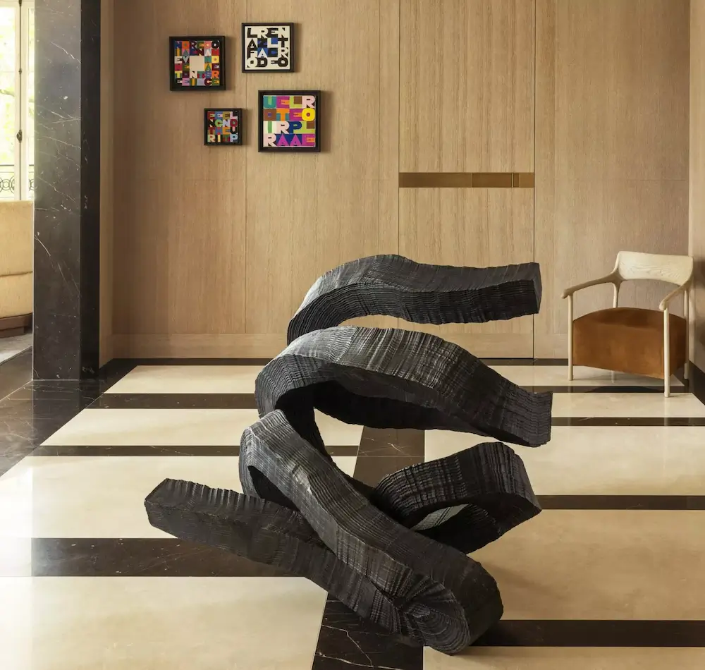
The clients are art lovers, and you can really tell that the apartment was designed around the collection rather than the art being added afterward.
That giant black sculptural piece in the gallery-like entry moment? Incredible. The smaller colorful works punctuating the quieter walls? Perfect restraint.
I think what makes it successful is that the interiors themselves already feel artistic. The architecture, materials, and furniture have enough sculptural quality that the art becomes part of a larger composition instead of competing for attention.
Honestly, this is something a lot of high-end interiors struggle with. Sometimes homes become either:
- sterile galleries, or
- overwhelming collections of statement pieces.
This apartment somehow avoids both.
The Overall Mood Is Quiet Luxury Before That Became An Internet Buzzword
I know “quiet luxury” has become wildly overused, but this home genuinely embodies the original idea behind it: exceptional materials, craftsmanship, proportion, and restraint.
Nothing here feels trend-driven. There are no gimmicks. No exaggerated styling moments. No performative minimalism.
Instead, it feels timeless and deeply intentional.
And maybe my favorite thing about the whole apartment is that despite all the richness—the marble, the dark woods, the custom detailing—it still feels peaceful. There’s a serenity to the palette and the composition that keeps the home from tipping into formality.
It’s elegant without being intimidating. Sophisticated without feeling cold.
Basically…exactly what I imagine living near the Eiffel Tower should feel like.
Discover more from Decoholic
Subscribe to get the latest posts sent to your email.