Erica Johnston’s Crescent Park project in Palo Alto is one of those rare homes that manages to feel both cinematic and deeply livable. A 1926 Spanish Colonial Revival brought lovingly into the present day, it’s all about texture, warmth, and the kind of quiet luxury that doesn’t shout—it glows.
If you’ve ever looked at handcrafted plaster walls and custom arched windows and thought, “That’s gorgeous, but how on earth do I afford that?”, you’re in the right place. This is your guide to recreating that Spanish Revival meets California-cool look on a real-world budget.
1. The Plaster Look — Without the Price

The Splurge: Authentic hand-troweled plaster and tadelakt in soft neutrals.
The Save: Lime-wash paint is the modern designer’s secret weapon. Try Portola Paints’ Roman Clay or Benjamin Moore’s Lime Wash Finish for that natural, movement-filled texture. Apply with a large masonry brush, and—this part is important—let the brush strokes show.
Designer tip: Don’t chase perfection. Slight variation and visible strokes are what make the walls feel old-world and soulful.
2. The Zellige Tile Moment

The Splurge: Authentic Moroccan Zellige tile—handmade, glossy, and beautifully irregular.
The Save: Go for clay-look ceramic tiles from Bedrosians, Riad Tile, or even Home Depot’s artisan-style lines. What matters is tonal variation; the beauty of Zellige is in its imperfection.

Try stacking tiles vertically or in a broken-bond pattern for a designer feel. Even at a fraction of the cost, the texture and reflection still create that unmistakable handcrafted vibe.
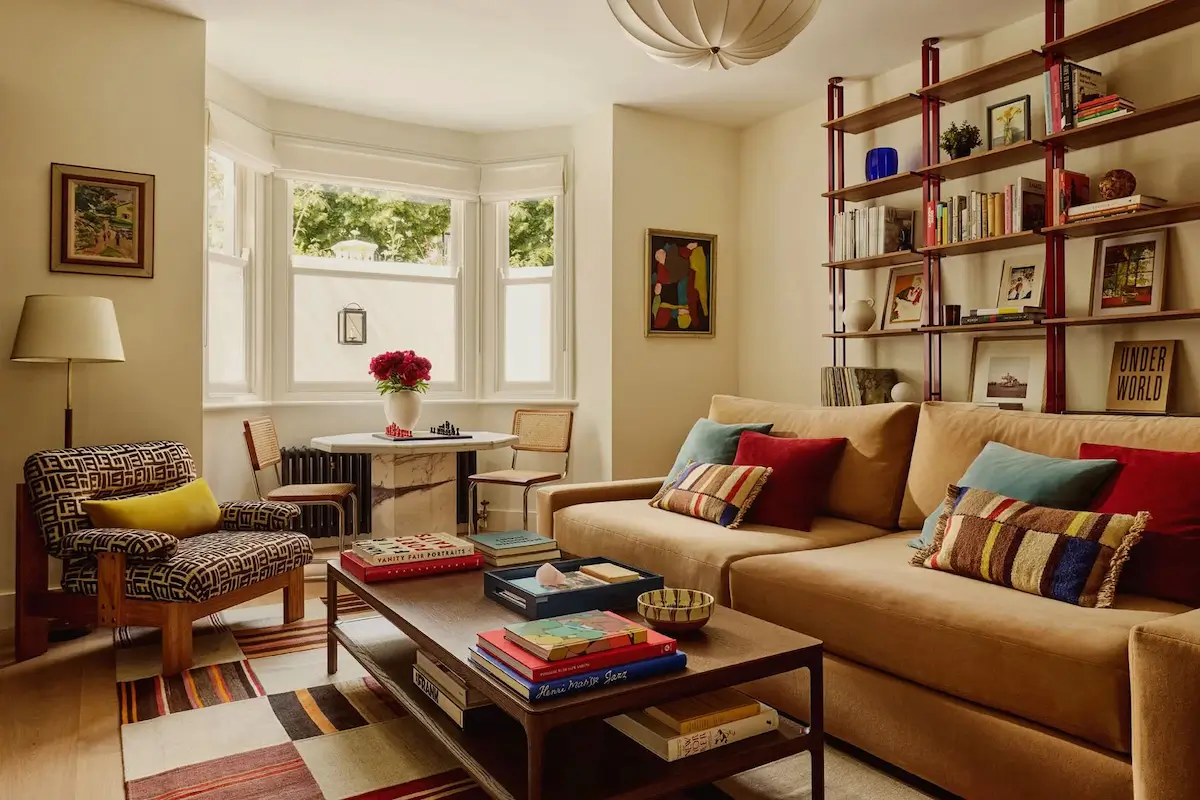
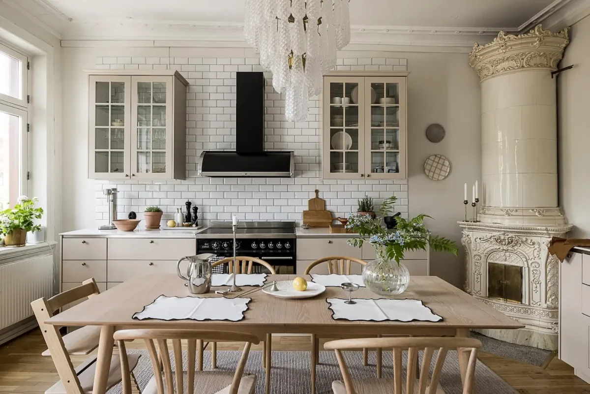
3. The Furniture: Mixing Tones for a Collected Feel

In the living and dining areas of this Spanish-Revival home, the furniture doesn’t try to match—it layers. That’s what gives it a look that feels collected, not catalog-ordered. Here’s how to channel that vibe in your own home:
- Mix wood finishes intentionally. The table might be rich walnut, the sideboard a lighter oak, and the accent chairs in a charcoal-stained wood. The trick: stick to the same undertone (warm rather than cool) so the pieces feel harmonious, even if they’re not identical.
- Vary upholstery textures and tones. One piece might be a neutral linen-blend chair, another a velvet or boucle in olive or mushroom. The difference in texture adds richness, the similarity in tone keeps it unified.
- Introduce metal and dark-toned accents. A blackened iron coffee table, a brass drawer pull, or a dark-stained side table give just enough contrast to keep the space grounded.
- Keep proportions clean, but forms approachable. The lines of the furniture here are tailored but relaxed—no overly ornate carvings or ultra-streamlined minimalism. It’s the sweet spot in between.
- Use visual anchors. A large wood dining table or a substantial upholstered sofa anchors the room, while smaller pieces (side chairs, console tables) bring in variation.
- Finally, to really get this right, be sure to read How to Mix and Match Furniture Like a Pro —it will help you feel confident mixing finishes, textures and tones yourself.

The rule of thumb: If everything matches too perfectly, the space will feel manufactured. But if you layer pieces that share complementary undertones and lets their differences show—wood finish, upholstery tone, metal finish—you’ll achieve that “time-worn, assembled overtime” look that feels timeless.
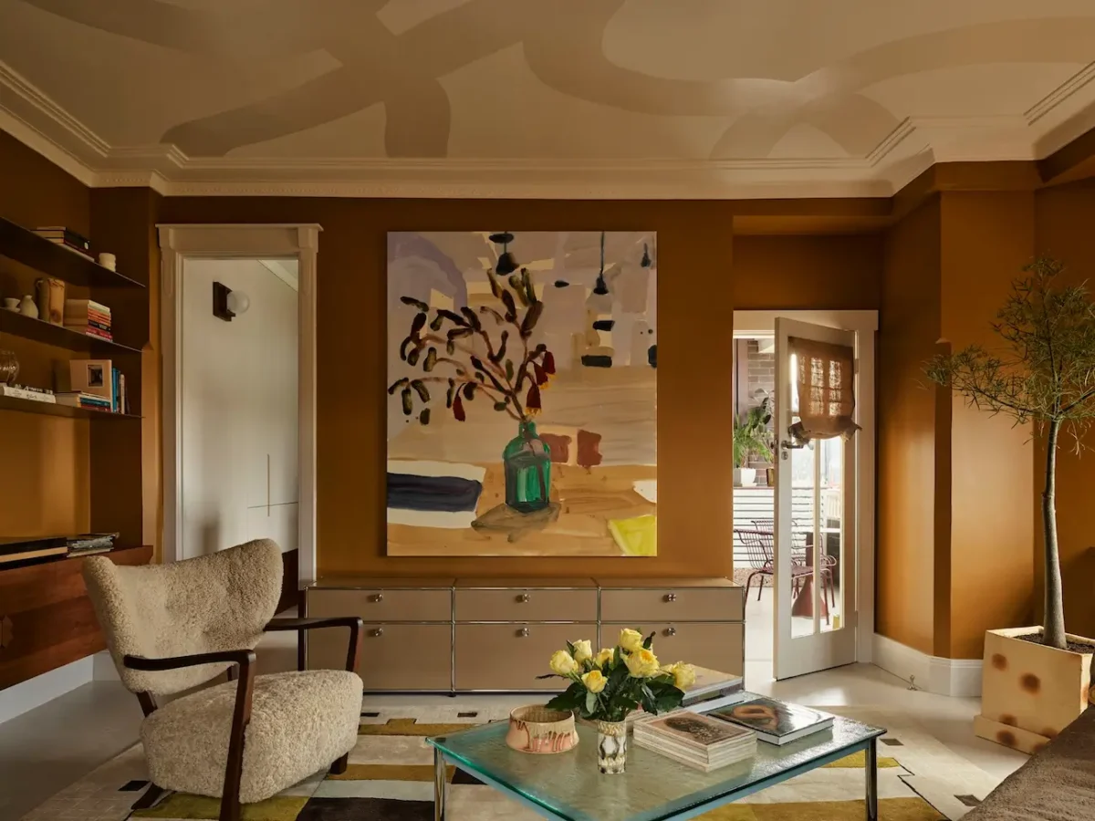
4. The Earth-Toned Palette

This house lives in the land of sun-bleached neutrals and soft clay hues. Every room feels like it was pulled from a California hillside or a Moroccan courtyard.
Get the palette:
- Walls: Mushroom beige or warm putty (try Benjamin Moore “Edgecomb Gray”)
- Textiles: Nubby linen, caramel leather, olive velvet
- Rugs: Vintage-style Turkish or Persian in terracotta tones
- Art: Line drawings and simple wood frames
Keep contrasts low and tones close. It’s about layers of warmth, not high-contrast drama.
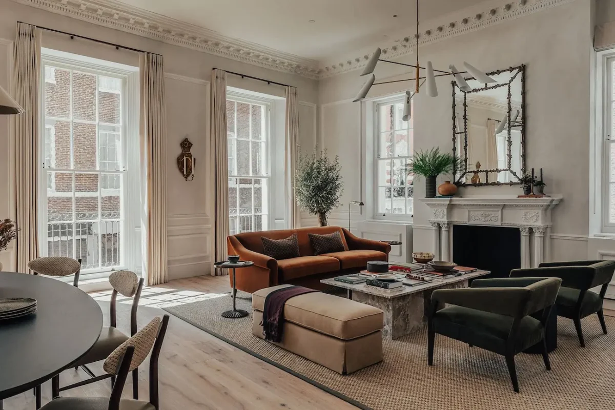
5. Lighting That Feels Collected

The Splurge: This home’s lighting story is a masterclass in quiet drama. In the dining room, a cascading glass chandelier steals the show — layers of hand-blown glass catching the light like jewelry. Over the kitchen island and in the tea room, globe prism pendants add sparkle and balance, their cut glass and brass detailing feeling both vintage and crisp. On the stairs, a sculptural blown-glass pendant framed in metal glows softly like a lantern. Even the bathrooms have that touch of 1960s Italian glamour, with textured glass sconces that diffuse light in the dreamiest way.
The Save: You can recreate the same atmosphere by mixing glass and metal finishes that feel artisanal, not factory-made. Look for tiered glass chandeliers, prism pendants, or frosted globe sconces in aged brass or bronze. Keep the shapes simple, the textures rich, and vary the scale room to room so it feels collected, not coordinated.
The rule: If it gleams too perfectly, it’s out. If it looks like it was crafted by hand — with a bit of air and history in it — it’s exactly right.
6. The Finishing Touches

In this home, the magic lies in the quiet moments — the subtle gestures that make every space feel curated yet effortless.
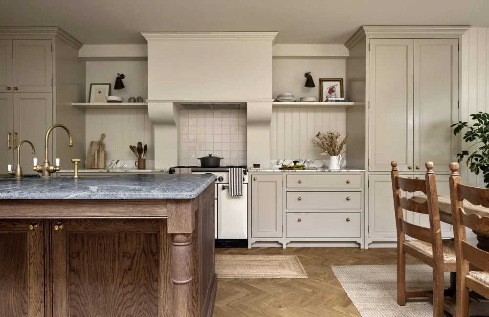
In the kitchen, a gallery of vintage-style green and cream plates brings softness to the creamy plaster walls. Their organic, botanical patterns echo the garden views beyond the arched doors, creating a gentle bridge between indoors and out. They aren’t rigidly aligned; instead, they feel casually composed — the mark of a collected, well-loved home.
Elsewhere, restraint takes the lead. The dining table stands almost sculptural, anchored only by a dramatic vase of greenery. The reading nook trades heavy curtains for a single Roman shade in textured linen, filtering sunlight just enough to cast that signature California glow.
The Save: To capture this look, focus on pieces that feel storied rather than new. Hang a small collection of hand-painted plates or ceramic platters on the wall. Choose window coverings that soften light but don’t steal attention — simple linen shades or natural-woven blinds work beautifully. Let materials like wood, marble, and clay speak for themselves, and keep styling minimal but intentional.
Because in homes like this, beauty isn’t shouted — it’s whispered, through craftsmanship, sunlight, and the perfect, imperfect balance of restraint.
If this Spanish Revival dream has you swooning, you’ll want to see these too:
- Spanish Style Homes That Are Works Of Art
- The Spanish Colonial-style Mansion That Leonardo DiCaprio Bought For His Mother
- Traditional Spanish Villa Turned Into a Stunning Ethnic-Scandinavian Dream Home
- 1930s Spanish Revival Remodel in L.A.
The Big Picture


What makes the Crescent Park home so compelling is the conversation between eras—1920s architecture meeting modern California living. Erica Johnston didn’t erase the past; she listened to it and elevated it.
You can channel that same balance at home. Respect what’s already there. Layer textures generously. Choose materials that age gracefully. Let imperfection lead.
Because great design isn’t about money or square footage—it’s about how a space feels when you walk in.
Discover more from Decoholic
Subscribe to get the latest posts sent to your email.