When you walk into your bedroom, you should immediately feel calm, safe, and rested — but some colors do the exact opposite. The wrong hues can make your space feel too busy, too cold, or too intense, and even impact how well you sleep. If your bedroom doesn’t feel quite right, one of these three colors might be the culprit.
Image: Wall Paint Color Benjamin Moore Iron Mountain 2134-30
Why Color Matters in the Bedroom
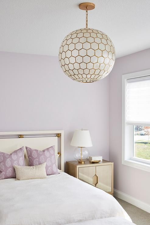
Image: Molly Howe Design / Wall color: Benjamin Moore’s Majestic Mauve, Honeycomb pendant, Table Lamp,
Your bedroom isn’t just where you rest your head — it’s a sanctuary. Color choices affect mood, stress level, and even your ability to relax. Decoholic’s article Sleep Like a Baby with These Bedroom Design Tips emphasizes how “calming and neutral colors like soft blues, gentle greens or muted greys … promote a sense of serenity and tranquility.”
The 3 Colors to Avoid & What to Do Instead
| Color | What Makes It Problematic | Better Alternatives |
|---|---|---|
| 1. Bright / Bold Red | Stimulates nerves, increases blood pressure — makes it harder to wind down. | Use deep muted tones or red only in small accents (pillows, art). Try softer jewel tones or muted rose instead. |
| 2. High-Intensity Yellow | Very energizing; can feel jarring and too bright especially in low-light. | Go for buttery yellows, creamy golds, or warm neutrals — they reflect light softly without overstimulating. |
| 3. Stark Pure White | Lacks warmth; tends to feel cold or clinical. Too much contrast can be harsh especially in the evenings. | Try warm whites, off-whites, or very pale creams. Also mix in texture (wood, fabric) to offset coldness. |
How to Choose Bedroom Colors That Support Rest & Style
- Use the Color Wheel Wisely: Decoholic’s Master the Art of Interior Design with the Color Wheel guide shows how color relationships (complementary, analogous, etc.) help you mix in accent tones that soften the harsher hues.
- Browse Real-Life Color Schemes: Check out 22 Beautiful Bedroom Color Schemes for ideas that balance color, warmth, and mood. Many examples use muted tones, soft contrasts, and warm textures.
- Incorporate Texture & Lighting: Even a pale color can feel cold if the room lacks warmth from lighting or soft materials. Lamps, rugs, curtains, and wood furniture all help. Decoholic’s article “Top 10 Decorating Ideas For A Better Bedroom” has excellent tips on creating ambiance through lighting and texture.
Real-Life Examples

- A bedroom painted pure red on a wall looked dazzling during the day — but at night the glare from lamps felt overstimulating. After repainting to a muted terracotta accent wall + warm beige elsewhere, the room felt twice as restful.

- One reader shared that stark white walls made their master bedroom feel like a hospital — once they added creamy curtains and a warm rug, the entire mood shifted.
Conclusion
To recap:
- Avoid: bright red, high intensity yellow, pure white
- Use instead: warm neutrals, muted tones, soft pastels, creams
- Balance colors with lighting, texture, and accent pieces
Your bedroom should help you decompress — so choose colors that soothe, not startle. If you want extra inspiration, head to Decoholic’s 26 Best Bedroom Wall Colors to see real photos of rooms that feel dreamy and restful.
Discover more from Decoholic
Subscribe to get the latest posts sent to your email.